A powerful combination is data analytics and visualization with Python. With libraries such as Pandas, NumPy, and Matplotlib, Python enables data manipulation and analysis. Tools at our disposal include Seaborn, Plotly, and Bokeh, which help us generate interactive and informative plots through visualization. Using these libraries enables us to conduct activities like data cleaning, mining, and modeling with statistics, as well as telling stories using data. Furthermore, machine learning in Python is supported by frameworks such as Scikit-Learn and TensorFlow.
1. Introduction
Data analytics and visualization are essential skills for data scientists, allowing them to interpret and present data in meaningful ways. Python, with its rich ecosystem of libraries, is a powerful tool for these tasks. This blog will explore essential data libraries for data analytics and delve into key libraries for plotting and visualization, specifically Matplotlib and Seaborn.
2. Essential Data Libraries for Data Analytics
Pandas
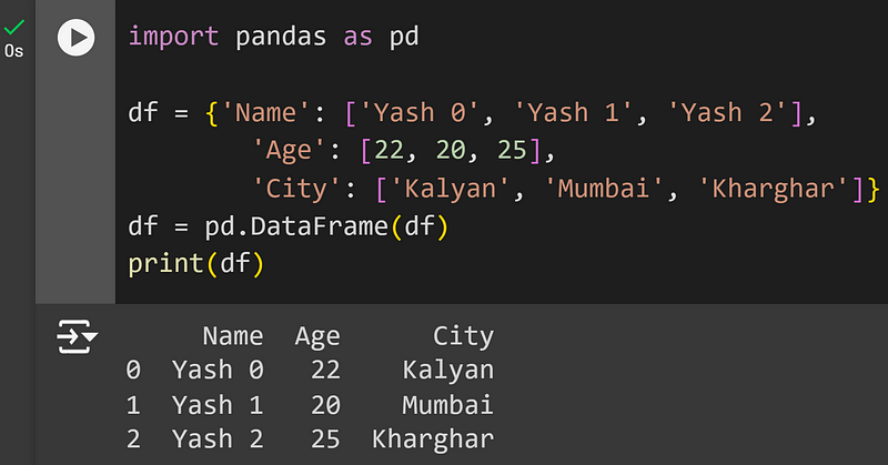
Pandas is a fundamental library for data manipulation and analysis in Python. It provides data structures like DataFrame, which are perfect for handling structured data.
DataFrames: Two-dimensional, size-mutable, potentially heterogeneous tabular data.
Series: One-dimensional labeled array capable of holding any data type.
Data Cleaning: Handling missing data, merging datasets, reshaping, and more.
Data Analysis: Statistical operations, grouping, pivoting, and more.
import pandas as pd

df = {'Name': ['Yash 0', 'Yash 1', 'Yash 2'],
        'Age': [22, 20, 25],
        'City': ['Kalyan', 'Mumbai', 'Kharghar']}
df = pd.DataFrame(df)
print(df)
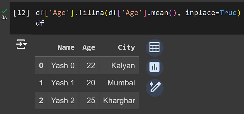
Pandas also allow for easy handling of missing data:
df['Age'].fillna(df['Age'].mean(), inplace=True)
df
NumPy
NumPy is the fundamental package for numerical computation in Python. It provides support for arrays, matrices, and many mathematical functions.
Arrays: Efficient storage and manipulation of large data sets.
Mathematical Functions: Operations on arrays, linear algebra, random number generation, and more.
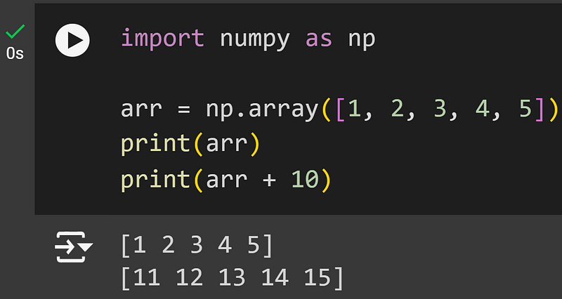
import numpy as np

arr = np.array([1, 2, 3, 4, 5])
print(arr)
print(arr + 10)
SciPy
SciPy builds on NumPy and provides additional tools for scientific and technical computing. It includes modules for optimization, integration, interpolation, eigenvalue problems, and more.
from scipy import stats

data = np.random.normal(0, 1, 1000)

statistic, p_value = stats.ttest_1samp(data, 0)
print(f"Statistic:- {statistic}, p-value:- {p_value}")

3. Plotting and Visualization with Python
Introduction to Matplotlib
Matplotlib is a plotting library for creating static, animated, and interactive visualizations in Python. It is highly customizable and produces publication-quality figures.
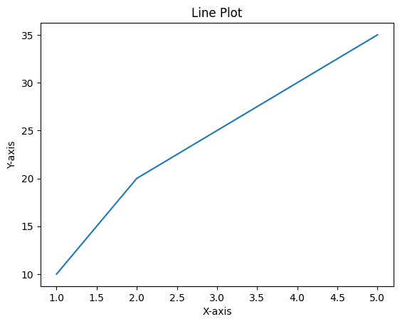
import matplotlib.pyplot as plt

x = [1, 2, 3, 4, 5]
y = [10, 20, 25, 30, 35]

plt.plot(x, y)
plt.title('Line Plot')
plt.xlabel('X-axis')
plt.ylabel('Y-axis')
plt.show()
Basic Plotting with Matplotlib
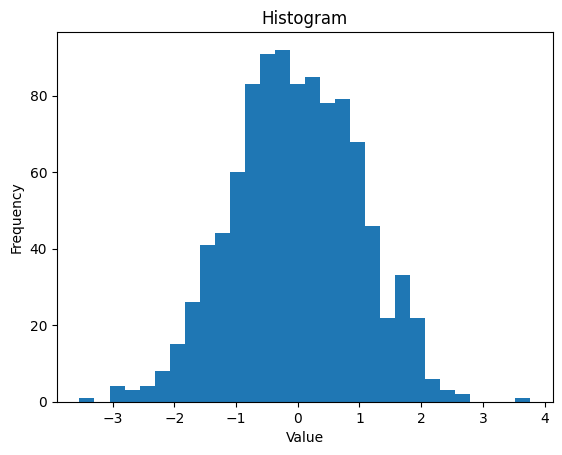
dt = np.random.randn(1000)

plt.hist(dt, bins=30)
plt.title('Histogram')
plt.xlabel('Value')
plt.ylabel('Frequency')
plt.show()
Bar Chart
categories = ['A', 'B', 'C']
values = [10, 20, 30]

plt.bar(categories, values)
plt.title('Bar Chart')
plt.xlabel('Category')
plt.ylabel('Value')
plt.show()

Pie Chart
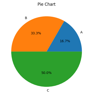
labels = ['A', 'B', 'C']
sizes = [15, 30, 45]

plt.pie(sizes, labels=labels, autopct='%1.1f%%')
plt.title('Pie Chart')
plt.show()
Box Plot
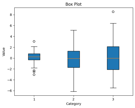
dt = [np.random.normal(0, std, 100) for std in range(1, 4)]

plt.boxplot(dt, vert=True, patch_artist=True)
plt.title('Box Plot')
plt.xlabel('Category')
plt.ylabel('Value')
plt.show()
Violin Plot
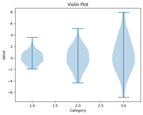
dt = [np.random.normal(0, std, 100) for std in range(1, 4)]

plt.violinplot(dt)
plt.title('Violin Plot')
plt.xlabel('Category')
plt.ylabel('Value')
plt.show()
Introduction to Seaborn Library
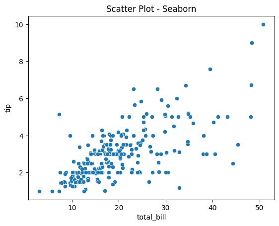
Seaborn is built on top of Matplotlib and provides a high-level interface for drawing attractive and informative statistical graphics. It makes it easier to create complex visualizations.
import seaborn as sns

tips = sns.load_dataset("tips")
sns.scatterplot(x="total_bill", y="tip", data=tips)
plt.title('Scatter Plot - Seaborn')
plt.show()
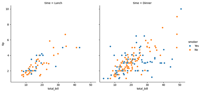
Multiple Plots
sns.relplot(x="total_bill", y="tip", hue="smoker", col="time", data=tips)
plt.show()
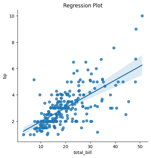
Regression Plot
sns.lmplot(x="total_bill", y="tip", data=tips)
plt.title('Regression Plot')
plt.show()
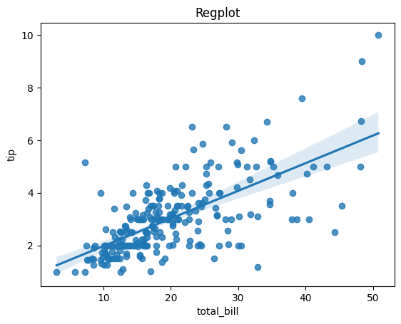
Regplot
sns.regplot(x="total_bill", y="tip", data=tips)
plt.title('Regplot')
plt.show()
Conclusion
Python offers a comprehensive set of tools for data analytics and visualization, making it an invaluable resource for data scientists. Libraries like Pandas, NumPy, and SciPy provide robust data manipulation and analysis capabilities, while Matplotlib and Seaborn allow for the creation of informative and attractive visualizations. By mastering these libraries, you can effectively turn complex data into meaningful insights.
